The Jeep logo is one of the most recognized emblems in the automotive world. Its simple wordmark, paired with a rugged image, instantly reminds people of adventure and durability.
But if you’ve ever looked closely and wondered, “What font is Jeep logo?
” you’re not alone. The answer is more interesting than you might expect, and it reveals a lot about branding choices in the car industry.
Let’s break down the details, history, and facts about the Jeep logo font, along with practical advice if you want to recreate the look.
The Font Used In The Jeep Logo
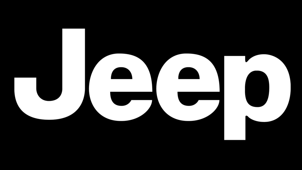
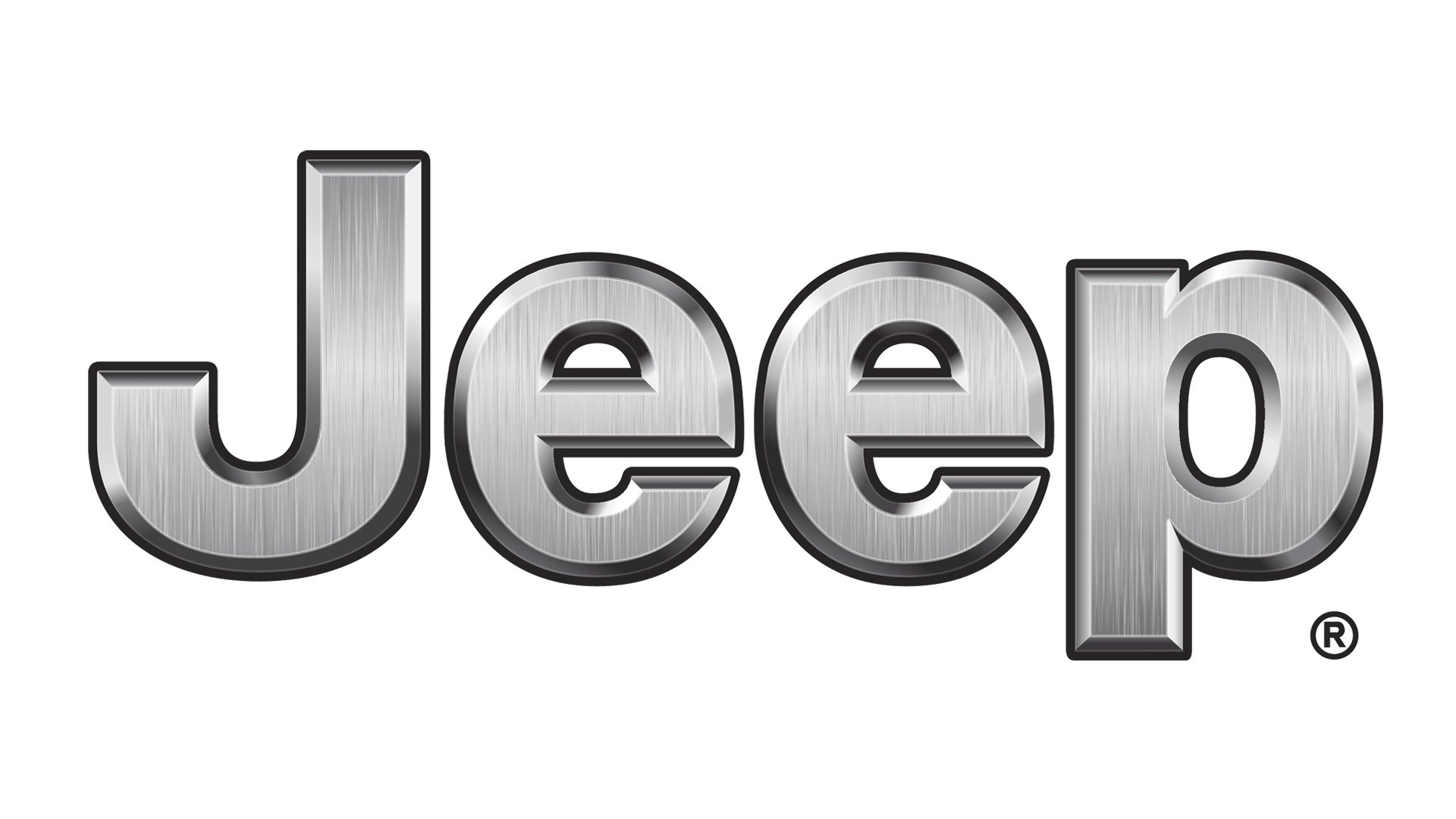
The current Jeep logo uses a clean, bold sans-serif typeface. Over the years, Jeep has made only minor changes to its logo, keeping the focus on simplicity and strength. This approach has helped the brand stay familiar and trustworthy to its customers.
Is The Jeep Font Custom Or Commercial?
The font in the Jeep logo is not a standard, off-the-shelf font. Instead, it is a slightly customized typeface based on Helvetica Bold. Designers made small changes to some letters to create a unique look.
- The “e” in “Jeep” is more rounded compared to standard Helvetica.
- The spacing between the letters is tighter, making the word feel compact and strong.
Because of these tweaks, you won’t find an exact match to the Jeep logo font in standard font libraries. Still, Helvetica Bold and Arial Bold are often used to create similar designs.
Visual Comparison: Helvetica Vs. Jeep Logo
To help you see the difference, here’s a side-by-side look at the Jeep logo font and Helvetica Bold:
| Typeface | Visual Example (“Jeep”) | Main Differences |
|---|---|---|
| Jeep Logo | Jeep | More rounded “e”, tighter spacing |
| Helvetica Bold | Jeep | Slightly squarer “e”, standard spacing |
This subtle customization helps Jeep stand out, even if most people don’t notice the details at first.
Why Jeep Chose This Font Style
Jeep vehicles are known for their ruggedness, simplicity, and functionality. The font style in the logo matches these values:
- Bold, simple lines: Show strength and clarity.
- Sans-serif: Feels modern and easy to read.
- Custom tweaks: Make the logo unique, but not flashy.
This balance helps Jeep appeal to both adventure lovers and everyday drivers. The font’s direct look also makes it easy to print or use on digital screens, which is important for a global brand.
The History Of The Jeep Logo Font
The first Jeeps appeared in the 1940s as military vehicles. For decades, Jeep vehicles didn’t use a consistent logo.
In the 1960s, the name “Jeep” started appearing on the vehicles’ bodies in simple, bold letters.
- 1940s-1960s: No fixed logo. Just the word “Jeep” in plain, bold fonts.
- 1970s-1980s: More branding, with the name getting its own style.
- 1990s-today: The current look, with the distinctive bold font, became standard.
This long history of using a straightforward wordmark has made the Jeep logo easy to recognize anywhere in the world.

How To Recreate The Jeep Logo Font
If you need to make a design with a Jeep-style font, use these steps:
- Start with Helvetica Bold or Arial Bold if Helvetica is not available.
- Adjust the “e” letters to make them a bit rounder.
- Decrease the spacing between letters for a compact look.
- Use a dark green or black color to match the original logo.
For most non-commercial uses, Helvetica Bold is close enough. For professional work, you may need a graphic designer to tweak the letters for a perfect match.
Alternatives To The Jeep Logo Font
Some free and paid fonts look similar to the Jeep logo. Here’s a quick comparison of popular choices:
| Font Name | Free/Paid | How Close to Jeep Logo |
|---|---|---|
| Helvetica Bold | Paid (Licensed) | Very close |
| Arial Bold | Free (Windows/Mac) | Close, but subtle differences |
| Jeepney | Free | Inspired by Jeep, but not exact |
| Univers Bold | Paid | Similar in style |
Remember, using an exact replica of the Jeep logo font for commercial products can violate trademarks. Always check usage rights before using a brand’s font or logo.
Common Mistakes When Imitating The Jeep Font
Many beginners make these errors:
- Using thin or script fonts: This loses the rugged, bold feel.
- Ignoring spacing: Proper letter spacing is important for the Jeep look.
- Choosing serif fonts: Jeep uses a sans-serif style for a reason.
- Wrong colors: Stick to black or dark green for authenticity.
Paying attention to these details will help your design look more professional.
Jeep Logo Font In Branding
The Jeep logo font is more than just letters. It’s a key part of the brand’s identity. The logo appears on:
- Vehicle grilles and rear doors
- Marketing materials and websites
- Merchandise like hats and shirts
This simple font, used consistently, makes Jeep stand out in a crowded market. It’s a lesson for any business: sometimes, simple and strong is the best choice.
If you want to learn more about the history of Jeep and its branding, the official Jeep Wikipedia page has a detailed overview.
Frequently Asked Questions
What Is The Exact Font Used In The Jeep Logo?
The Jeep logo uses a customized version of Helvetica Bold. Designers made small changes, especially to the “e” letters and spacing.
Can I Use The Jeep Logo Font For My Own Project?
You can use similar fonts like Helvetica Bold or Arial Bold for personal projects. For commercial use, avoid copying the exact Jeep logo to prevent trademark issues.
Is There A Free Font That Looks Like The Jeep Logo?
Arial Bold is a common free alternative. The free font “Jeepney” also has a similar feel but is not an exact match.
Why Did Jeep Choose A Simple Font Style?
A simple, bold font matches Jeep’s brand values: strength, clarity, and ruggedness. It’s easy to recognize and works well on all types of materials.
Has The Jeep Logo Font Changed Over Time?
The basic style has stayed similar since the 1970s, with only small changes to the font’s shape and spacing. The consistent look helps people instantly recognize the brand.
The Jeep logo font is a great example of how small design choices can make a big impact. If you want your brand to be remembered, consistency and simplicity often work best.